I’ve been recently diving into front end development and am discovering the power of CSS and image manipulation. Previously I had known about adjusting the shape of corners was done with border-radius property:

Of course this method easily produces those cool circular profile pics that you see all the time:

But what if you want to create an image with “cut corners”?

I discovered that CSS has an element called polygon. With this you can create all sorts of shapes, like stars, if you wanted. For the task at hand, you can create the cut corner with the following:
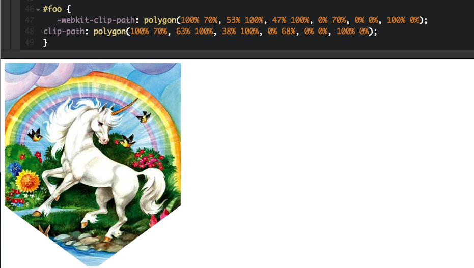
All the values within the ‘polygon’ could be overwhelming so let’s walk through it. Essentially each grouping is a point. So… polygon(x1 y1, x2 y2, x3 y3, x4 y4, x5 y5, x6 y6);. The image is basically on an x-axis and y-axis where the upper left corner is (0,0) coordinate and bottom right corner is (100%, 100%) coordinate.

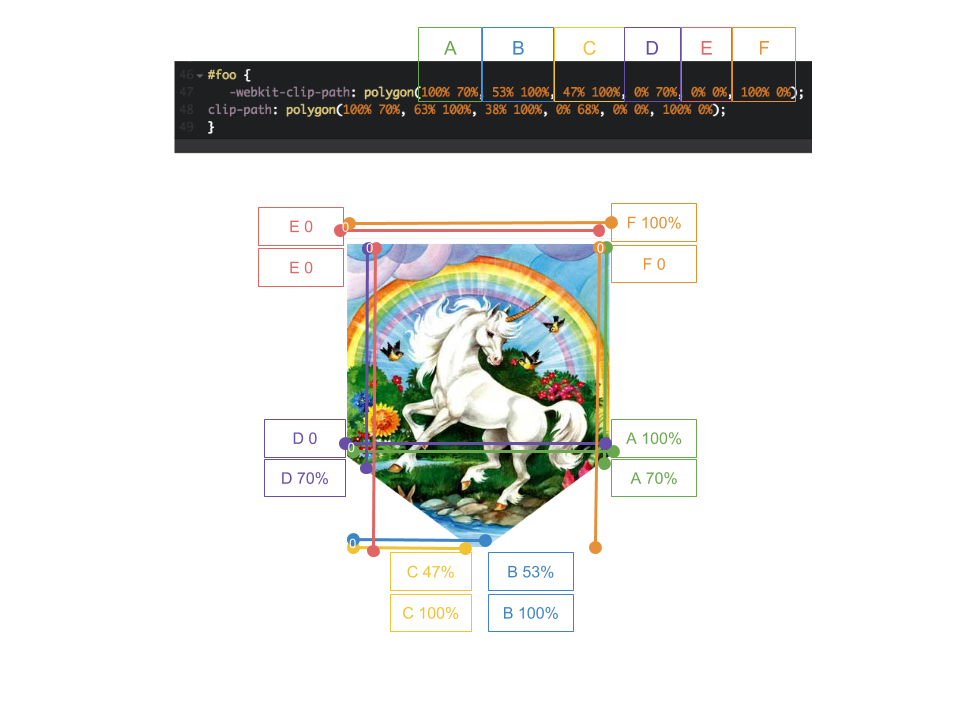
I’d recommend practicing adjusting the values of the points to get more comfortable. You can use CodePen and here is one that I made:
See the Pen polygon by Charlotte Chang (@glamouracademy) on CodePen.
Also Bennett Feely has a great tool for making clip-paths via CSS called Clippy.